BLNKD Studio

Edit Template

10 UX Mistakes That Hurt Your Website’s Conversions

BLNKD STUDIO

Great Design Means Nothing If the User Experience Fails

You can have the most stunning visuals, but if visitors can’t find what they need, they’ll leave — fast. User experience (UX) design isn’t just about aesthetics; it’s about guiding users smoothly toward taking action. In this post, we’ll cover the 10 most common UX mistakes that silently kill conversions — and how to fix them.

guy frustrated
confused woman
confused man with phone

Mistake #1: Slow Load Times

A Beautiful Website Won’t Help If It’s Slow

Every extra second your site takes to load increases bounce rates and decreases trust. In today’s fast-paced digital world, users expect instant results. Optimize your images, use caching, and test regularly with Google PageSpeed Insights.

user experience interface
Responsive View

Mistake #2: Poor Mobile Optimization

Mobile Users Are Not an Afterthought

More than 60% of users browse on mobile. If your site isn’t responsive or elements overlap, you’re losing conversions. Great UX adapts naturally across all devices — ensuring buttons are clickable and text is easy to read.

Mistake #3: Confusing Navigation

If Users Can’t Find It, They Won’t Buy It

Menus with too many options or unclear labels overwhelm visitors. Simplify your navigation — make it intuitive and consistent. Think: fewer clicks, faster decisions.

man working for website
CTA Button

Mistake #4: Weak CTAs (Calls to Action)

Don’t Leave Users Wondering What to Do Next

Your visitors need direction. Whether it’s “Get a Quote” or “Shop Now”, CTAs should stand out visually and be strategically placed across your pages.

Mistake #5: Overloaded Pages

Clutter Confuses — Simplicity Converts

Too many elements can overwhelm users and slow your site down. White space is your friend. Focus on what truly matters: clarity, readability, and a visual hierarchy that leads to action.

Female Designer
Working Designer

Mistake #6: Inconsistent Branding

Every Page Should Feel Like You

If your logo, colors, and tone shift across pages, it breaks trust. Consistency in branding helps users feel confident they’re in the right place — and builds recognition.

Mistake #7: Ignoring Accessibility

Accessibility Isn’t Optional Anymore

Not everyone experiences your website the same way. Add alt text, ensure proper contrast, and make forms keyboard-friendly. Accessibility enhances UX and even improves SEO.

line graph
Customer Review

Mistake #8: Lack of Trust Elements

Without Trust, Conversions Don’t Happen

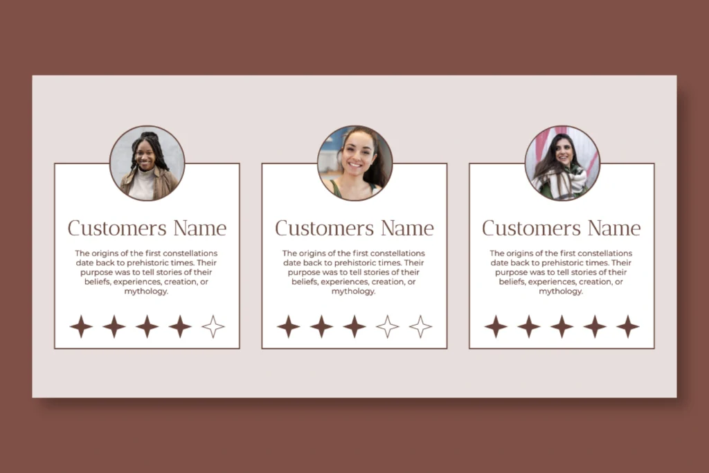
No testimonials, unclear contact info, or missing SSL certificate? These erode credibility. Add proof points — like client logos, security badges, and success stories — to reassure visitors.

Mistake #9: Ignoring Analytics and Feedback

You Can’t Improve What You Don’t Measure

If you’re not tracking behavior through tools like Hotjar or Google Analytics, you’re designing blind. Regularly test what works — and refine based on data, not assumptions.

employee working
How to choose designers

Mistake #10: Forgetting About Ongoing Maintenance

A Website Isn’t a “One-and-Done” Project

Over time, broken links, outdated plugins, and design bloat hurt user experience. Continuous maintenance keeps your site running fast and error-free — ensuring every click counts.

Great UX Isn’t Just Design — It’s Strategy

Your website should guide, not confuse. Every design choice should move visitors closer to taking action. At BLNKD Studio, we combine UX strategy, branding, and web development to create websites that look incredible — and perform even better.